

- within Consumer Protection topic(s)
Abstract
DSM-Firmenich AG (hereinafter referred to as "the
Applicant") entrusted Kangxin Partners, P.C. to file a review
of refusal for the trademark "  " (No. 74959837 in Class 9, hereinafter
referred to as "the Applied Mark") by the China National
Intellectual Property Administration (CNIPA). The CNIPA ruled to
approve the registration of the Applied Mark after review.
" (No. 74959837 in Class 9, hereinafter
referred to as "the Applied Mark") by the China National
Intellectual Property Administration (CNIPA). The CNIPA ruled to
approve the registration of the Applied Mark after review.
Background
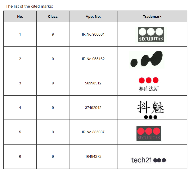
The Applied Mark was filed on November 3, 2023, designated for use on goods in Class 9, including computer software and related products. The CNIPA initially rejected the application, citing six cited marks, as listed below. The Applicant argued that the Applied Mark was distinctive and sufficiently different from the cited marks in terms of visual appearance, pronunciation, and overall impression, thus unlikely to cause consumer confusion.
Key Issues
In this case, the key issues are:
Trademark dissimilarity: Whether the Applied Mark is sufficiently distinctive compared to the cited marks in terms of the following aspects:
- Visual elements (three-dot design vs. cited marks' graphics)
- Textual components ("dsm-firmenich" vs. "SECURITAS"/Chinese characters)
- Overall impression
Consumer Confusion: Whether coexistence of the marks would likely cause confusion amongst relevant public.
Case Analysis
1. Creativity and originality of the Applied Mark
- The Applied Mark combines the textual element "dsm-firmenich" with a three-dot graphic design. The text, being the dominant element, differs significantly from the cited marks' textual components ("SECURITAS", Chinese characters, etc.).
- While all marks contain dot/round elements, the Applied Mark's three-dot configuration represents the merger of two entities (DSM and Firmenich), creating unique conceptual meaning absent in the cited marks.
2. Comparison with Cited Marks
The Applicant thoroughly demonstrated that the Applied Mark ("dsm-firmenich & device") was distinct from the six cited marks in terms of visual composition, textual elements, pronunciation, and conceptual meaning, making confusion among consumers unlikely. Below is a structured analysis of the key differences:
- Visual and Graphic Differences: While all marks contain circular elements, their arrangement, color, size, and contextual use differ significantly. The Applied Mark's design carries a specific corporate meaning, whereas the cited marks' dots are either decorative or arbitrary.
- Textual and Phonetic Distinctions: The Applied Mark's unique textual composition and pronunciation prevent any phonetic or linguistic overlap with the cited marks. Consumers would not associate them verbally or conceptually.
- Distinctiveness and Consumer Perception: The applicant emphasized that composite marks must be evaluated as a whole, not by isolated elements.
- Precedent Alignment: The applicant referenced prior cases where marks with common graphical elements but distinct text were deemed not similar (e.g., "MY CONSULT & device" vs. graphic-only marks). This consistency in examination standards supported the Applicant's argument.
Case Inspiration
1. Strategic Argumentation in Review of refusals
Success required:
- Detailed visual/textual comparisons based on the Trademark Examination Guidelines (isolated/overall/key-element comparison)
- Highlighting conceptual meaning behind design elements
2. Precedents Matter
The Applicant effectively cited 12 similar cases where marks with
common graphical elements but different text were deemed
non-confusing. This demonstrated consistent examination
standards.
3. Technical vs. Subjective Elements
The case shows how technical comparisons (design elements) must be
balanced with subjective factors (overall impression, consumer
perception).
The content of this article is intended to provide a general guide to the subject matter. Specialist advice should be sought about your specific circumstances.
