
Graphs may seem like a safe, simple way to visually convey information to consumers, but they present a minefield of potential hazards for the unwary advertiser. In this post, we will explore one minor tweak that can transform a graph from accurate to misleading: the truncated graph.
First, it is crucial to understand that advertisers are responsible for all reasonable interpretations of their ads. Obviously, this includes intentionally-conveyed messages. However, it also extends to those messages that were unintentionally conveyed. Advertisers must therefore be wary of making claims that can be reasonably interpreted in a variety of different ways, or could easily be misinterpreted, because they may be called upon to provide supporting evidence for claims they did not intend to make, and cannot support.
Graphs are one particularly easy way to fall into the trap of unintentional messaging. Whether they be line, bar, scatterplot or otherwise, graphs make frequent appearances in ads. And for good reason – they can be an effective way to visually depict product data, particularly as a means of distinguishing between competing products. But without proper precision, they can easily lead audiences astray.
Most graphs have two axes – an X-axis (the horizontal line at the bottom) and a Y-axis (the vertical line, typically on the left-hand side). These axes usually bear labels showing what is being measured (e.g. product efficacy on the Y axis and time on the X axis would show "efficacy as a function of time" or, more simply, how well a product performed at certain times).
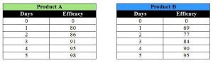
Let's say you have two sets of data showing efficacy over time for products A and B. Your efficacy is measured in percentages, with a scale from 0 to 100, and your time points are measured in days at one-day increments from 0 to 5. Your data sets look like this:
There are myriad ways you could represent these data. The most straightforward is a simple line graph with your Y-axis going from 0 to 100 and your X going from 0 to 5, like so:
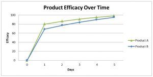
This graph clearly shows that Product A performs better than Product B, albeit not by a huge amount. So what do you do with these data? The graph won't blow anyone out of the water – it's not as if Product A outperforms B by 30, 40 or 50 percent. And the space between the product lines is simply not big enough to catch anyone's eye.
When faced with this kind of problem, some advertisers will use what's known as a truncated graph, where part of the Y-axis is removed. Here are the same data used in the above graph, but plotted with a truncated Y-axis:
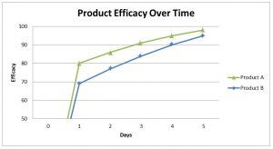
If you look carefully at the Y-axis, you'll find that it is incomplete, or "truncated" – the bottom half is missing, in this case. This has the effect of drastically increasing the space between the two product data lines. Here, because half of the Y-axis was removed (and therefore half the graph), the space between the lines showing efficacy for products A and B is doubled. This has the visual effect of vastly overstating – indeed, doubling – the difference between the products. While a thorough inspection of the image would reveal the manipulation, it would not be unreasonable for a consumer to glance at this chart, see a large gap between A and B, and conclude that A is far superior – an unsupported conclusion.
This kind of graph manipulation has been consistently rebuffed by the National Advertising Division – a branch of the Better Business Bureau responsible for resolving disputes about national advertising, typically between an advertiser and a competitor.
In the NAD decision Zoetis Inc. (Simparica), Report # 6013, NAD Case Reports (October 2016), which concerned canine anti-parasite products, NAD recommended discontinuation of an ad featuring a truncated line graph much like the above example:
NAD was also concerned about the manner in which the graphs were depicted in Zoetis' advertising. The Y-axis in the graph is shorter from 0-70 than it is between 70 and 100. This truncated Y-axis does not reflect the actual efficacy scale from 0-100 and could reasonably convey a message overstating the performance differences between the products. For the foregoing reasons, NAD recommended that Simparica discontinue its chart demonstrating the comparative efficacy of Trifexis and Simparica... (emphasis added)
Similarly, in Colgate-Palmolive Company (Colgate Sensitive Pro-Relief Toothpaste), Report # 5443, NAD Case Reports (March 2012), an NAD decision about toothpaste advertising, NAD stated:
NAD was further troubled that the graphs shown in the advertisement are truncated. The "tactile sensitivity" graph only extends from 0 to 30 grams of force, rather than the full 50-gram scale. Likewise, the "air blast sensitivity" graph only shows sensitivity scores ranging from 0.0 to 1.0, rather than the full scale which extends to a 3.0 score. By omitting the top end (31-50 grams) of the Yeaple scale, and the top end of the Schiff scale (1.1-3.0), these graphs exaggerate the difference between the products at two weeks. NAD therefore recommended that Colgate either discontinue the graphs that are shown in the professional advertisement, or modify them such that the scales do not visually exaggerate the differences between the products. (emphasis added)
And in Unilever United States, Inc. (Degree MotionSense and Degree Clinical Protection Antiperspirants), Report # 5819, NAD Case Reports (March 2015), in a dispute over antiperspirant advertising, NAD again found:
NAD was also concerned about the manner in which the graphs were depicted in both commercials. The graphs are truncated and do not reflect the actual scales used in the studies. In the Degree Men commercials, the scale is from 0 to 70 percent, not 0 to 100. Similarly, in the Degree Women's commercials, the scale is from 0 to 3, not 0 to 10. The truncated graphs dramatically overstate the performance differences between the two variants. (emphasis added)
While graphs are clearly an effective means of persuasion, advertisers must be wary of how they're deployed. Truncating your graph may seem like an easy way to spruce up your ad, but if the message conveyed doesn't conform to the underlying data your ad will be susceptible to a challenge at NAD.
The content of this article is intended to provide a general guide to the subject matter. Specialist advice should be sought about your specific circumstances.