
- within Intellectual Property topic(s)
- in European Union
- in European Union
- in European Union
- within Insurance and Wealth Management topic(s)
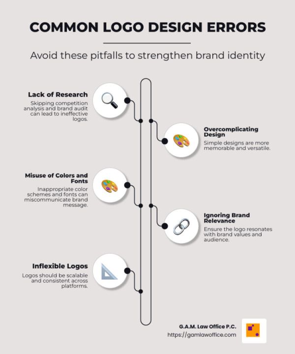
Logo design errors can dramatically impact a company's first impression and overall brand identity. A poorly designed logo can leave a business struggling to stand out and may even hinder its ability to connect with the target audience. Here's a quick rundown of some common mistakes that can damage a brand's visual identity:
- Lack of research and planning
- Overcomplicating the design
- Misuse of colors and fonts
- Ignoring brand relevance
- Inflexible and inconsistent logos
The first impression of a business often comes from its logo. It's the symbol that people remember and associate with your brand. A successful logo is not just attractive; it also conveys the essence of the brand's values and mission succinctly. Ensuring your logo is distinct, memorable, and appropriate is key to maintaining a strong brand identity.
LACK OF RESEARCH AND PLANNING
Creating a logo without proper research and planning is like building a house without a blueprint. It's risky and often leads to failure. The first step in avoiding logo design errors is conducting thorough research and planning. Here's why it's crucial:
Competition Analysis
Before designing a logo, it's important to understand the competition. By analyzing competitors, you can identify what works and what doesn't in your industry. This helps in creating a logo that stands out rather than blends in.
- Look at their logos: What colors and symbols do they use?
- Identify gaps: Is there a common element missing that you can leverage?
By knowing what your competitors are doing, you can design a logo that is unique and memorable.
Industry Norms
Every industry has its own set of design norms. For example, tech companies often use sleek and modern designs, while vintage logos might suit a bakery. Familiarizing yourself with these norms ensures your logo is appropriate for your field.
- Research industry trends: What are the typical design elements?
- Align with expectations: Ensure your logo fits within these trends while still being distinctive.
Understanding these norms allows you to create a logo that resonates with your audience and reflects your brand's position in the market.
Brand Audit
A brand audit is a comprehensive evaluation of your brand's current position. This includes understanding your brand's values, mission, and vision. A well-conducted brand audit informs the logo design process and helps avoid misalignment.
- Define your brand essence: What message do you want to convey?
- Clarify your objectives: What should your logo communicate about your brand?
By conducting a brand audit, you ensure that your logo accurately represents your brand and connects with your target audience.
In conclusion, lack of research and planning can lead to a logo that fails to represent your brand effectively. By conducting competition analysis, understanding industry norms, and performing a brand audit, you can create a logo that is both unique and aligned with your brand identity. This groundwork is essential to avoid common pitfalls and ensure your logo leaves a lasting impression.
OVERCOMPLICATING THE DESIGN
Simplicity is the secret sauce of great logo design. A simple logo is easy to recognize and remember. It communicates your brand's message quickly. But when designers try to pack too much into a logo, it becomes cluttered and confusing. Let's explore why overcomplicating the design is a common mistake and how to avoid it.
The Beauty of Simplicity
A simple design doesn't mean boring. It means clear and focused. Think of the Nike swoosh or the Apple logo. These logos are iconic because they're simple and effective. They don't need extra details to tell their story.
- Why simplicity matters: Simple logos are easier to remember. They work well across different media and sizes.
- Avoid unnecessary elements: Every part of your logo should have a purpose. If it doesn't add value, leave it out.
Cluttered Logos
When too many elements are crammed into a logo, it becomes cluttered. A cluttered logo is hard to read and understand. It can overwhelm the viewer, making them lose interest.
- Signs of a cluttered logo: Too many colors, fonts, or symbols. Complex graphics that are hard to decipher.
- How to declutter: Focus on what's essential. Use one or two colors. Stick to one font. Simplify your graphics.
Detailed Design
Detailed designs can be visually appealing but often fail as logos. Logos need to be versatile. They should look good on a business card and a billboard. Detailed designs don't scale well and can lose clarity at smaller sizes.
- Why details can be problematic: They make logos less flexible. Details can get lost or blurred in small or digital formats.
- Keep it flexible: Ensure your logo is recognizable in black and white, and at any size.
By focusing on simplicity, avoiding clutter, and minimizing details, you can create a logo that is not only beautiful but also functional. A logo is a communication tool. It should convey your brand's identity clearly and effectively.
MISUSE OF COLORS AND FONTS
Colors and fonts are the unsung heroes of logo design. They can make or break your logo. Let's explore how the misuse of these elements can lead to logo design errors.
Color Psychology
Colors speak a language of their own. They evoke emotions and set the tone for your brand. For example, blue often conveys trust and professionalism, while red can evoke passion and urgency.
- Understand your audience: Choose colors that align with your brand's values and the emotions you want to convey.
- Avoid color overload: Stick to two or three colors. Too many colors can make your logo look chaotic and unprofessional.
Typography
Typography is more than just picking a pretty font. It's about choosing a typeface that reflects your brand's personality.
- Font choice matters: A playful font might suit a toy store, but a law firm needs something more serious and professional.
- Consistency is key: Use fonts that are easy to read and consistent across different platforms.
Font Choice
Choosing the right font is crucial. It affects readability and how your brand is perceived.
- Avoid trendy fonts: Trends come and go. Your logo should stand the test of time.
- Pair fonts wisely: If using more than one font, ensure they complement each other. Mismatched fonts can confuse your audience.
By understanding color psychology and making thoughtful choices in typography and font selection, you can create a logo that resonates with your audience and strengthens your brand identity.
IGNORING BRAND RELEVANCE
Logos are more than just pretty pictures; they're powerful symbols that communicate your brand's essence. Ignoring brand relevance in your design can lead to logo design errors that disconnect your audience from your brand.
Audience Connection
Your logo should speak directly to your target audience. Think about who they are and what they care about. For instance, a tech startup might use sleek, modern design elements to appeal to a younger, tech-savvy audience. On the other hand, a family-owned bakery might use warm colors and a whimsical font to convey a sense of tradition and comfort.
- Know your audience: Identify their preferences and values.
- Tailor your design: Ensure your logo resonates with those who matter most to your business.
Brand Values
Your logo is a visual representation of what your brand stands for. If your values include sustainability and eco-friendliness, your logo should reflect that. Perhaps through earthy colors or natural imagery.
Consider this story: A local coffee shop chose a sketch of the founder's grandpa's favorite mug over a generic steaming cup. This choice not only told a story but also connected deeply with their community.
- Reflect your values: Use imagery and design elements that align with your core principles.
- Tell a story: Let your logo be a narrative that your audience can connect with.
Generic Imagery
Using overused symbols can make your logo blend into the crowd. A logo that looks like every other in your industry won't stand out. Instead, strive for uniqueness. A study found that 30% of brands with unique logos saw a significant increase in brand recognition.
- Avoid clichés: Steer clear of generic icons that don't add value to your brand.
- Be creative: Innovate with symbols that are unique to your brand story.
Ignoring these aspects can dilute your brand's message and weaken its impact. By focusing on audience connection, brand values, and avoiding generic imagery, you ensure your logo is not just a design, but a powerful brand ambassador.
INFLEXIBLE AND INCONSISTENT LOGOS
Creating a logo that looks great is just the start. Ensuring it's flexible and consistent across all platforms is crucial to avoid logo design errors.
Scalability
Your logo needs to look good whether it's on a giant billboard or a tiny social media icon. This is where scalability comes in. A scalable logo maintains its quality and readability at any size.
- Think big and small: Design your logo to work on both large and small scales.
- Test it out: Check how your logo looks in various sizes before finalizing.
Vector Files
To achieve scalability, vector files are your best friend. Unlike JPEGs, vector files don't lose clarity no matter how much you resize them. They are essential for maintaining the sharpness and quality of your logo.
- Use vector formats: Save your logo in formats like SVG or AI.
- Edit with ease: Vector files allow for easy editing in design software like Adobe Illustrator.
Logo Guidelines
Once your logo is designed, consistency is key. This is where logo guidelines come into play. These guidelines ensure that everyone uses your logo correctly, maintaining its integrity across all platforms.
- Create a guideline document: Include details on logo size, placement, and color usage.
- Provide real-world examples: Show how your logo should appear in different contexts.
A consistent logo builds trust and recognition. When your audience sees the same logo everywhere, it reinforces your brand's identity. A lack of consistency can confuse your audience and weaken your brand's image.
By focusing on scalability, using vector files, and establishing clear logo guidelines, you ensure your logo is not just visually appealing but also a strong, reliable representation of your brand.
FREQUENTLY ASKED QUESTIONS ABOUT LOGO DESIGN ERRORS
What are common pitfalls in logo design?
Logo design is an art and a science. Even seasoned designers can stumble into common pitfalls. Here are a few to watch out for:
- Ignoring Context: A logo must fit within the context of where and how it will be used. For instance, a logo that looks great on a website might not translate well to a business card or a billboard. Always consider the various contexts in which your logo will appear.
- Lack of Teamwork: Designing a logo is often a team effort. Failing to involve different perspectives can lead to a design that doesn't fully capture the brand's essence. Collaboration ensures a well-rounded approach.
What makes a logo ineffective?
An ineffective logo fails to communicate the brand's identity or differentiate it from competitors. Here are a few reasons why a logo might miss the mark:
- Poor Differentiation: If your logo looks like everyone else's, it won't stand out. It's crucial to create a unique design that sets your brand apart. Avoiding trends and clichés can help in crafting a distinctive logo.
- Weak Brand Identity: A logo should be a visual representation of your brand's core values and mission. If it doesn't resonate with what your brand stands for, it won't connect with your audience.
What are the five errors in using design patterns?
Design patterns can make or break a logo. Here are five common errors to avoid:
- Inappropriate Font Choice: Fonts convey emotions and messages. A playful font might not suit a law firm, just as a formal one might not fit a toy store. Choose fonts that align with your brand's personality.
- Kerning Issues: Kerning refers to the space between letters. Poor kerning can make a logo look unprofessional and affect readability. Ensure that the spacing between letters is even and balanced.
- Overcomplicated Patterns: Too many patterns can clutter a logo, making it hard to read and understand. Simplicity is key.
- Ignoring Legibility: A logo should be easy to read at any size. Complex patterns can hinder legibility, especially when scaled down.
- Failure to Adapt: Design patterns should be versatile. A logo that relies heavily on intricate patterns might not work well in all formats, such as embroidery or embossing.
By avoiding these logo design errors, you can craft a logo that effectively represents your brand and resonates with your audience.
CONCLUSION
At G.A.M. Law Office P.C., we understand that a well-designed logo is more than just a visual element. It's a powerful tool that can communicate your brand's identity and values. Crafting a logo that avoids common logo design errors is crucial to building a strong brand presence.
Our firm specializes in providing custom legal counsel for businesses, artists, and creatives. We offer strategic advice to help you protect your brand through trademark registration and other legal services. By securing your logo and brand identity legally, you can focus on growing your business with peace of mind.
We believe in a proactive approach to safeguarding your brand. This means not only creating a logo that stands out but also ensuring it's legally protected. Our team is here to guide you every step of the way, offering transparent communication and custom solutions that align with your business goals.
If you're ready to take the next step in protecting your brand, learn more about the importance of trademark registration. Let us help you steer the legal landscape and secure your brand's future success.
The content of this article is intended to provide a general guide to the subject matter. Specialist advice should be sought about your specific circumstances.