
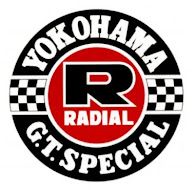
The USPTO refused to register the word-plus-design mark shown below, for various clothing items [YOKOHAMA disclaimed], finding confusion likely with the registered mark RADIALWEAR for overlapping clothing items. Since the goods are in part identical, a lesser degree of similarity is necessary between the marks to support a Section 2(d) refusal. But are these marks confusable? How do you think this appeal came out? In re The Yokohama Rubber Co., Ltd., Serial No. 79271385 (October 30, 2021) [not precedential] (Opinion by Judge George C. Pologeorgis, dissent by Judge Albert Zervas).
The panel majority found that, because of the overlap in goods, the second DuPont factor "heavily favors a finding of likelihood of confusion." Moreover, the Board must presume that the overlapping goods travel in the same channels of trade to the same classes of consumers.
Applicant Yokohama argued that the mark RADIAL is weak in light of third-party registrations, but there was no evidence regarding use of those third-party marks; only three of the registrations were for marks containing the term RADIAL and those three were for services rather than goods.
As to the marks, the panel majority found the word RADIAL to be the dominant element of Yokohama's mark and the cited mark:
First, the average purchaser will generally associate each mark, even when viewed in its entirety, with the term "RADIAL", because the wording is arbitrary and distinctive as it relates to the clothing items offered by both Applicant and Registrants. With regard to the cited mark, the constituent term "wear" has little to no source-indicating significance because it is the generic name for Registrants' goods. *** As for Applicant's proposed mark, the letter R, which is the largest literal portion of Applicant's mark in terms of size, position, and emphasis, would be seen and understood by consumers as reinforcing and focusing attention to the arbitrary term "RADIAL." This especially holds true since the letter "R" and the term "RADIAL" appear in the center of Applicant's mark highlighted by a red background that would draw the attention of consumers to the middle of the mark.
The majority observed that "the mere addition of wording and a design to the dominant wording 'RADIAL' does not overcome a finding of likelihood of confusion, despite any minor changes it may make in appearance, sound, or meaning."
The panel majority therefore found confusion likely and it affirmed the refusal.
Judge Zervas, in dissent, opined that the marks are not confusingly similar:
Applicant's mark is a very busy mark. There are many features - the tire design, the large "R," the term YOKOHAMA, the terms G.T. SPECIAL, the two checkered flags, the different fonts and the multiple colors. These multiple features render it implausible that RADIAL is a dominant feature. Why a consumer would hone in on the smallest word in such a busy mark and find it to be "dominant" is inexplicable, unless, of course, the consumer too engages in a similar formulaic analysis.
Read comments and post your comment here.
TTABlogger comment: How did you do? What do you think is the dominant element of Yokohama's mark?
The content of this article is intended to provide a general guide to the subject matter. Specialist advice should be sought about your specific circumstances.
