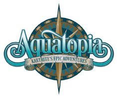
The USPTO refused registration of the mark THE KARTRITE and the word+design mark shown first below, for a raft of goods and services in classes 12, 14, 16, 18, 20, 21, 25, 28, 35, 41, 43, and 44, including "providing waterpark services," finding a likelihood of confusion with the registered mark AQUATOPIA KARTRITE'S EPIC ADVENTURES + Design, shown second below, for "indoor waterpark services." On appeal, the Board found some of the involved goods and services to be related, but what about the marks? Are they confusingly similar? In re Catskill Resorts TRS, LLC, Serial Nos. 88337961 and 88338045 (March 31, 2021) [not precedential] (Opinion by Judge Christopher Larkin).


The Board, unsurprisingly, found that the word "Aquatopia" is the dominant portion of the cited mark because "it comprises the largest literal portion of the mark in terms of size, position, and emphasis," and because it "is also the first term in the mark, further establishing its prominence." Aquitaine Wine, 126 USPQ2d at 1184-85 (citing Palm Bay Imps., 73 USPQ2d at 1692). As to the applicant's logo mark, the Board agreed with the Examining Attorney that the word "kartrite" is the dominant element, not the styilized letter "k."
Comparing the marks in their entireties, and Board found applicant's standard character mark and the cited mark to be dissimilar. Even recognizing that the standard character could be presented in the same font, size, and color as the words Aquatopia or Kartrite's Epic Adventures in the cited mark, the Board could not "similarly assume, however, that Applicant's mark may be accompanied by the compass design that is the backdrop for the words in the cited mark." The visual impact of the words other than "Kartrite's" in the cited mark would still make the marks dissimilar.
Moreover, in verbalizing the cited mark, "many consumers would not include the tagline and would refer to the registrant and its services as 'Aquatopia,' which sounds much more like a waterpark and nothing like 'THE KARTRITE.'" And even if all the words in the cited mark were verbalized, "the first word that is heard is 'Aquatopia' and the phrase as a whole is more dissimilar than similar in sound to 'THE KARTRITE' due to the presence of 'Aquatopia' and the words other than 'Kartrite's' in the cited mark."

As to connotation, THE KARTRITE suggests a place, whereas "Kartrite's Epic Adventures" in the cited mark suggests a person. The marks differ in commercial impression for the same reason.
As to the two design + word marks, the Board found them to be dissimilar in appearance, sound, and connotation and commercial impression for many of the same reasons stated above, and so it concluded that the first DuPont factor weighed against a finding of a likelihood of confusion as to the composite mark.
Balancing the pertinent DuPont factors, the Board found that the dissimilarity of the marks outweighed the legal identity or similarity of the goods and services in Classes 18, 21, 25, 28, 41, 43 and 44, and therefore it reversed the refusal in its entirety.
Read comments and post your comment here.
Originally Published by Wolf Greenfield, April 2021
The content of this article is intended to provide a general guide to the subject matter. Specialist advice should be sought about your specific circumstances.
